
Book cover
I’m sure we’ve all heard that saying ‘don’t judge a book by its cover’. Mum and I certainly have, and it’s something that we don’t quite believe in! Let’s face it, as humans we are so quick at automatically judging things, and this is exactly why the cover of our book had to be perfect. It had to tell our story and have meaning. It had to be bright and fun to fit with the overall vibe and brand of the book. It had to show the colours of Gujarat. And of course, it had to create a good first impression to reflect the quality of the inside pages. We could have gone down the route of simply having a picture of food on the front cover, but we quickly came to realise that this wouldn’t tell our story well, it wouldn’t do the best job of differentiating us amongst other cookbooks, and it wouldn’t be very different from the inside pages. So considering all of the above, how did we choose what our book cover would look like?
Exploring cover ideas
Right from the very start, we always had this idea of our cover having two pairs of hands from different generations, passing spices down from one pair to the other. We weren’t really sure how this would exactly look, but what we loved about this idea was how it had the potential to really strongly communicate our story of passing recipes down through generations to preserve the authenticity of Gujarati food in our family. It also literally shows ‘pass it on’, with spices being passed from one person's hands to the other, helping to give context to the book name. The hands also add a human touch to emphasise our family story. When we engaged with our designer Jess about this idea, she loved it and wanted to explore it further, but she also wanted to look at other ideas. One of the many reasons why we loved working with Jess was because she didn’t settle for an idea without exploring and properly investigating other options. It was really eye opening to go through the design phase for the cover and the approach of concepting. She encouraged us to explore other cover options that were both pure design and also photography based, to make sure we were 100% certain with our choice. It was critical to think everything through properly because the decision we made for our cover didn’t just define what the cover would look like, but it also influenced the style for the inside pages. To explain this a little more, some key elements from the cover would flow to the inside pages to make the whole book feel whole and complete end to end, so we had to make a good decision. Keeping all of this in the backs of our minds, these were some of the concept options we explored together that Jess created:

After a lot of exploring and thought, we stuck with our original hands idea. Even though we stuck with this idea, it was still super valuable to go through the exploration process of the other ideas because it really justified our decision. And who knows, in other cases we may have even changed our minds and chosen a different explored option! I guess the point here that I learnt is that it’s important to be open minded and explore a range of options to see all of the possibilities before settling on a decision to avoid any missed opportunities - and we’re so thankful for Jess making us realise this.
Colours & hand placement
Now that we had a decision on our cover concept, we started to think a layer deeper to bring it to life. We first explored a range of colours and how our arm/hand placement could look:

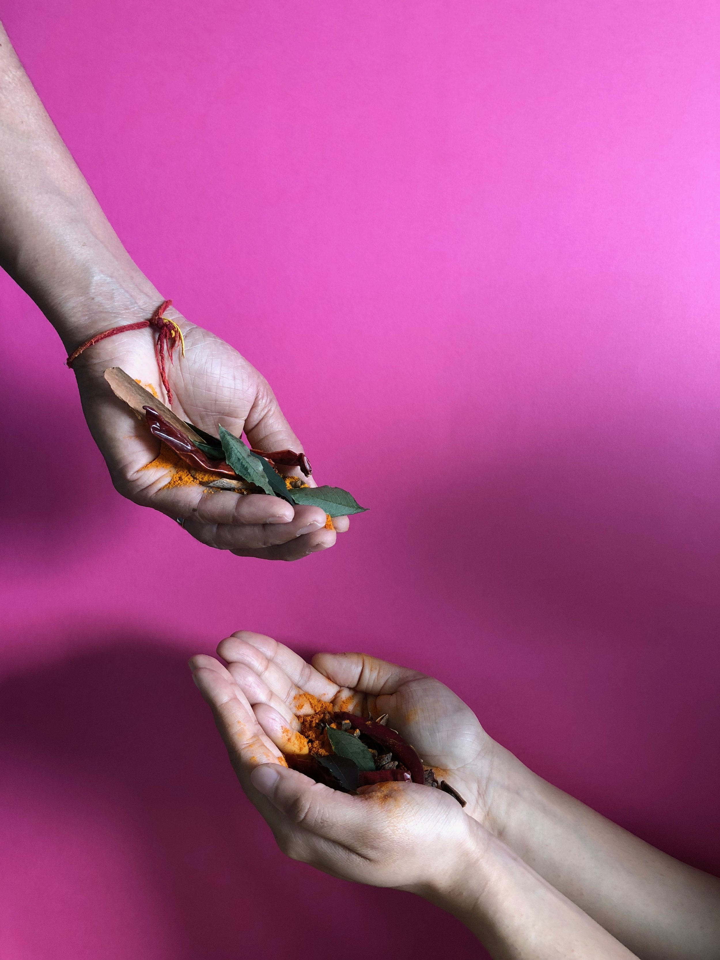


After seeing these images, Mum and I easily agreed that we loved the pink version the best - because who doesn’t like pink?! The shade also reminded us of India and Gujarat the most. In terms of hand position, we liked how mum’s hand was at the top passing the spices into my hand. The flow felt right and we thought it also provided a good amount of space to add text to the cover without it looking overcrowded.
Henna/Mehndi
As we continued looking at the test images, we felt that they looked a little bare, and could probably do a better job at communicating the Indian culture. This is where the idea of henna came in, where we could have intricate patterns drawn on our hands to show our culture without it taking away the focus from the key message. The henna itself required lots of thought, ensuring we had the right symbols drawn on our hands as each symbol means something different. We primarily chose flowers for happiness and joy, paisleys for luck, and vines and creepers for longevity and vitality. Once we chose our designs, we got them drawn on our hands and lower arms by the magnificently talented Varsha. It took a whopping 5 hours for both Mum and I to have our henna done, but it was totally worth it. Once our henna was piped onto our hands, we slept with it on overnight before washing the dried henna off the next day. This allowed our body heat to bring out the deepest colour and allow the ink to last longer ready for our professional cover photoshoot.


Shooting the cover
A couple of days later we had our cover photoshoot, and this was a pretty exciting day! The project felt a whole lot more real, and we were able to tick another tangible milestone off the list. The amazingly talented Chris Burks was our book cover photographer, and he did an incredible job of converting our cover concepts with Jess into reality. It got a little messy throwing spices around to get the ‘perfect shot’, but it all added to the fun. Jess and Chris worked together during this shoot, instructing Mum and I on where to put our hands and when Mum should start passing the spices into my hands. This made sure that all elements were balanced, we had great lighting and angles, we had good visibility of spices as they were being passed from Mum’s hand to mine, and we had the perfect amount of space for the main book title. After a couple of dedicated hours, we got the perfect shot! Here’s what they looked like:


Completing the cover
Once the cover image was captured and processed by Chris, Jess did an incredible job of completing it. She found the right fonts, aligned and sized everything perfectly, and added some beautiful finishing touches such as gold foiling. After a few feedback loops and tweaks, the front cover was complete!


The back cover
That was the front cover, but books have back covers too which are also super important! I don’t know about you, but I certainly read the back cover of books when I pick them up to get more of a feel and understanding of the book. Based on this and the fact that we as humans are so quick to make judgements, the back cover also needed a bit of thought. We worked on this after the front cover was finished, but of course we had an idea of what look and feel we wanted to go for. As we did the design concepts for the section pages for the inside of the book, we decided to have bright and bold contrasting colours to help show the vibrancy of Gujarat. For the back cover, we brought this ‘contrasting colour’ idea over which is how we decided to have orange on the back to contrast with the pink. You wouldn’t usually match orange and pink, but you totally would in India! By bringing this contrasting colour idea to the whole cover, it really fits with the inside design to make the entire book flow and feel complete. We also wrote some text on the back cover to provide readers with an understanding of the book, and also added an image of Mum’s mouth watering traditional chicken curry, which is one of the classics we eat all the time at home. Showing this bowl of curry helps show the book as a recipe book since the front cover doesn’t have any food. I shot the photo of the back cover on bright orange paper, and after processing it I passed it to Jess who then blended the colours into the main orange background to make it all look like one background colour. Here’s what it looks like:


And that’s how we created our front and back book covers! I hope you judge our cookbook by its cover with the amount of thought and energy behind it all, and I hope you experience a great first impression to set you up for reading the inside pages. It’s been such a great team effort creating the cover, and we honestly couldn’t be happier.
Keryn Kalyan